Picture This!

Guest blog post by R. Allan Reese

From the start, Downing Streets’ daily COVID press conferences have included various graphs slightly amended each day.  In mid April on the Allstat list, I described the presentation and labelling of these graphs as “Boilerplate Excel” and was duly reprimanded for “slagging the people concerned off behind their backs” with “destructive criticism”.  That was not my intention, nor do I accept that criticising a presentation equates with being derogatory about the author. I stand by the assertion that an equivalent lack of attention to spelling, grammar or punctuation would not be condoned in a PR organisation.  The Downing Street presentations were not prepared by hard-pressed, front-line health staff, but by media-savvy folk around the PM.  I wrote to the press office but received no response.

The basis for my criticisms comes from an approach I call Graphical Interpretation of Data (GID), expounded for example in various articles in Significance, freely available online.  Number 10’s daily sequences of graphs and data are available at https://www.gov.uk/government/collections/slides-and-datasets-to-accompany-coronavirus-press-conferences.

It could be argued that changing a style of presentation risks accusations of “spin” if this detracts from the day-to-day comparison.  However, some changes were made mid-stream. Initially, the daily numbers of deaths were plotted on a log scale labelled obscurely “5, 100, 2, 5, 1000, 2, 5, 10k” (Figure 1). The Daily Telegraph published a redrawn version labelling the grid line below the 5 with “0”.  The label “5” actually meant 50 deaths to allow the trajectory for each country to be aligned from the day 50 deaths were reported.  This is all very confusing.

Fig 1: 30 March. Early line graph with enigmatic Y labels and poor linkage to key.

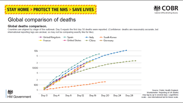
I wrote to the Telegraph about this, and their presentations improved, as did Number 10’s, with labels 50, 100, 200, 500, etc.  The Metro commented on 1 April that the log scale made the growth in number of deaths appear less steep.  They quoted David Spiegelhalter that each presentation has its “advantages and disadvantages” and “there is no ‘right’ way”. However, less mathematically-minded readers would surely see the choice and the changes as spin.

On 8 April these presentations switched to a linear scale with a scale labelled “2K, 4K, 6K …”, thus avoiding showing “real” numbers or a disturbing axis title “Thousands of deaths”.  I described the use of ‘K’ as “nerdy”, especially as K in IT means a power of 2, not 1000.  It is notable that the daily format of the press conferences was a speech by a minister who then handed over to a scientist or medic to describe the graphs, reinforcing the attitude that graphs are for “boffins” – they might be over your head, dear simple reader.

Within GID one often has to guess at the intention of the author: Was the choice of notation accidental or deliberate?  Whom was this graph designed to inform?  I think we have to assume the direct audience are journalists who then interpret the graphs and data for their readership.  On the other hand, some features are so clearly defaults in spreadsheet graph production (e.g. text written horizontally or vertically), that I stand by the assertion that these presentations were handed out without further consideration or editing.

Downing Street’s daily “Global comparison of deaths” compares countries using a line chart. Initially the lines were just colour-coded with a separate key. Then the country names were written at the end of each line. Because each country’s “Day 0” was a different date, all the lines were different lengths.  Because there were ten lines, some were difficult to identify, as some colours were very similar and there was no redundancy (variation in other line characteristics).  The intended message appeared to be that the UK was buried in the middle, on a similar trajectory to the rest of Europe, with the US far worse (nearly three times as many deaths), while China and South Korea had fared much better.

It’s pretty obvious that crude numbers of deaths is a poor comparator, and there is much confusion between numbers of deaths and death rates. BBC’s More or Less (22 April) discussed this and identified the problem that converting using deaths per million population flung San Marino and Andorra to the top.  But you have the same problem calculating rates for many statistics by London boroughs: Westminster may come out top because so few people live there but many people commute.  The GID approach is to draw a graph (of numbers or rates), consider what message you wish to put across, and to revise the graph to clarify and emphasise.

Cristl Donnelly, on More or Less, suggested a better comparison would be to look at excess deaths in each country. This could also be standardised for population size, but might also allow a division into excess deaths from COVID and excess collateral deaths due to non-availability of other health services.

Another graph showed the number of deaths reported daily.  In the first weeks this was for hospitals only, but from mid-April it showed Daily COVID-19 Deaths in All Settings.  Note this was not necessarily the day the person died. Once the “peak” was passed, it was stressed in most presentations that there was a strong weekend effect with greater delays in reporting and hence a jump up each Monday. As a result the bar graph looks quite chaotic. A 7-day rolling average line clarified the general trend, but no visual effect was used to indicate weekends and the dates were labelled at 3-day intervals. Surely a good presentation would demonstrate the periodicity? (Fig 2)

Fig 2: 30 April. The bars show large day-to-day fluctuations while the smoothing line gives a clear, and more comforting, pattern. Which are weekends?

The other graph I draw attention to is the daily “New UK Cases”, based on the number of positive (PCR for antigen) tests reported that day (Fig 3). Initially this was constrained by test availability. By the third week of April a large excess of laboratory capacity over sampling numbers was reported.  According to the rubric, “there are likely many more cases than currently recorded here”, predominantly because sampling was restricted to hospital patients and staff, then extended to wider NHS staff and care workers, but (at the time of writing) not to the wider population.

Fig 3: 19 April.  The numbers written on bars were subsequently dropped as a separate data file was available. Without knowledge of the number of negative tests, it’s hard to evaluate any trend.

Showing the number of positives against an increasing number of daily tests, but not showing the number of tests, disguises any trend in prevalence. It would help if the number of tests or the proportion positive were also reported; these might be split to show the proportions in groups showing symptoms (expected high) and those tested as contacts (hopefully, lower).  Such comparisons were further hindered by gerrymandering the number of tests in late April to claim to have reached the arbitrary target of 100,000 tests “on” 30 April.

Among the problems with this chart are: the dates are written vertically with no indication of weekends or other divisions that might aid interpretation; the actual numbers are written on the bars, again vertically and hard to compare; for two thirds of the period shown the number varied between 4K and 6K and the largely overdrawn grid gives no assistance for comparison; most of the bars are split into two sections, linked to an enigmatic key (Pillar 1 and 2) which requires further recourse to the rubric for an explanation.

The split between “pillars” had me for one puzzled. It derived from the Secretary of State’s plan for five pillars of activity, but at various times the spokesmen distinguished the groups either by the targets for sampling (patients and hospital staff showing symptoms versus wider NHS staff and households) or by the place of testing (PHE versus commercial labs). I failed to find on the website any clear definitions to discriminate between “critical” and “key” workers.  By the end of April this graph had become quite impossible to learn from: the number of cases detected by NHS labs was going down despite PHE opening its Lighthouse labs but the number from other mass testing (private) labs appeared to increase each day. Hence, it appeared to say nothing about the national prevalence and, since there was no effective treatment, offer no assistance to individual patients.

My interpretation is that this is a case of “reporting the data” out of a sense of duty or as a totem to show the approach is “scientific”.  The layout obscures any visible trend except to show Pillar 2 as increasing over its range. High counts on 5 and 8 April are balanced by lows values on 4, 6 and 7 April, so a smoothing line would make the graph far easier to understand.  Having so many written numbers makes this far more of a table than a graph; it’s no good on a screen, especially during a presentation, but you can print it and turn it sideways. Or you could opt for horizontal bars with time running down the screen; this layout fits less well on a landscape screen, but could be split into a row of panes by week.

For screen use, one could easily angle the dates, add grid lines or background shading for weekends and Easter, round the numbers and omit the commas, move the “6K” gridline to label the actual maximum and add a 5000 gridline, change “0K” to “0”, and make the key one-stage.  As the interest is always in the latest figures, one could move the Y labels to the right-hand end.  I would reconsider the colours: the orange is intrusive and a “warning” tint, and the blue is quite dark. Lighter, more neutral colours for the bars would go better with an overlain smoother.

None of this is rocket science or takes much time or resource, but it does show one has thought about the graph and the audience. It shows competence and consideration.

Call for Papers for a Coronavirus special issue

Papers from all disciplines are invited on any relevant topic addressing political aspects of data and statistics.

Joint Editors are John Bibby and Roy Carr-Hill. Please submit an indicative title and brief description. Email: jb43@york.ac.uk

Papers are due by 1st May 2020, for publication the same month (provisional).

Recent issues of the journal are viewable at https://www.radstats.org.uk/journal/.

2020 Conference and Events

2020, London: “Learning from the Past to Build a Better Future
Friday 28th & Saturday 29th February, 2020
Radical Statistics 46th annual conference will take place at
St Luke’s Community Centre, 90 Central St, London EC1V 8AJ.
Register on Eventbrite.
On Saturday, 29th at the same location Radical Statistics will hold its AGM, discussion about Data in Society, and an extended discussion on the future of Radstats, as we approach our 50th year. All welcome.

Register now – Radical Statistics 2020 Conference

“Learning from the Past to Build a Better Future”

London: Friday 28th February 2020, with associated events on 27th and 28th February evenings, and the morning of 29th February.

The 46th annual Radical Statistics Conference will take place at St Luke’s Community Centre, 90 Central St, London EC1V 8AJ.

2020 marks the bicentenary of the birth of Florence Nightingale who was noted as “The Passionate Statistician”. We are proud to mark this with a Keynote Address from Lynn McDonald of Guelph University, world authority on Nightingale and editor of her collected works. Lynne’s talk is entitled “Florence Nightingale and Statistics: What She Did and What She Did Not”.

There will be many other talks and plenty of time for discussion, including:

Danny Dorling on The UK health crisis
Eileen Magnello on Nightingale: A radical and passionate statistician
Andrew Street on Revisiting Nightingale’s vision and hospital outcomes

Dave Byrne on The IFS Deaton review
Paul Marchant on Bad Stats and the public purse
Greg Dropkin on Radiation & A-bomb survivers in Japan

And discussion and sessions on the new Radical Statistics book ‘Data in Society: Challenging Statistics in an Age of Globalisation’

On the following morning, Saturday the 29th, Radical Statistics’ AGM will be held at the same location. In addition all are invited to discuss the future of Radical Statistics as an organisation as we prepare to enter our second half-century. There will be informal social events on the evenings of the 27th and 28th. We hope to end with a guided walk on a FN theme by a professional guide, immediately following the Saturday meeting.

Registration is now open.

Radical Statistics 123 (2019)

Cover pages
Editorial

Submitted Papers

Lies, damned lies, metrics & semantics: Exploring definitions of the end of leprosy (Hansen’s disease) and their implicationsF Houghton, M Winterburn, S Lama & B Cosgrove
Teaching for citizen empowerment and engagementJim Ridgeway & Rosie Ridgeway
Book Reviews


New Book: Data in Society – Challenging Statistics in an age of globalisation – with greatly reduced ‘pre-order’ price for members
Ludi Simpson
News


Minutes of AGM at Liverpool

Commission on ‘Future of Radical Statistics’

Radical Statistics Conference 2020

Revision of Book Reviewing process

New Book: Data in Society – Challenging Statistics in an age of globalisationwith greatly reduced ‘pre-order’ price for members


Editorial, Issue 121

This issue is now available online.

I/we had hoped – yet again – that this issue would include some of the conference papers but it was not to be.  However, my rather hopeless intervention at the beginning of the London Conference, which most –including myself – thought unlikely to be successful has, in fact generated several papers from new authors that not only filled the previous issue but provided a surplus for this issue (although none for the next!).

Contents of this Issue

The result of course is that the contents of this issue are again a mixed bag, so they have been put in the reverse order of author’s surnames (to distinguish from the previous issue).  Westart, with a critique of statistics as reification from Simeon Scott, including diatribes on Lies, Damned Lies and Statistics, Bolshevism and Statistics, IBM and the Nazis, Identity Politics, the Neutrality of Numbers, the Mean value as Reification, Big Data, the Data Scientist, Econometrics concluding with the Tyranny of Numbers. It is followed by anovel approach by Daniel and Burns to map real pedestrian catchment areas by factoring in elevation to the street networks to understand daily journey-to-work commuting behaviour, taking Milton in Galasgow as an example. As expected, the ‘real’ ‘ped-shed’ is smaller than the 2D ‘ped-shed’for both current and proposed networks. This research builds on existing established practice in walkability analysis, and prompts a discussion on other factors which may affect walkability and could be included in a more sophisticated walkability index.

After that there are two short articles.  Houghton contributes an expose of corruption and mismanagement in Irish Credit Unions, set up to be an ethically ‘cleaner’ than the disgraced banking sector, in their operation of prize draws (Misappropriation of funds; Mismanagement of prize draws funds; Poor systems and controls; Lack of independence where officers of the credit union have been prize-winners).  The last article is a final contribution by Roy Carr-Hill on meta analyses, examining the specifically statistical issues.  The issue is completed by a comprehensive report on the 2018 Conference in London.

Prospects for RSN 122
We now have no material for the next issue RSN 122, due late January. We would like it to be at least partly devoted to the 2018 conference
papers, and the Editor has written to each of the speakers
asking if they can produce a paper but we think it would also be very
useful if any of those who attended (or did not attend) have any ideas
or thoughts on the subjects raised could make a contribution, however
short. I/we have written to all of the authors individually and circulated
all members asking them to submit anything they want to write
on one or more of the themes addressed in the conference.

The themes addressed at the conference were the issue of inequality
as it relates to income, reproductive health and intimate partner violence,
while the fourth explored the feasibility of low-carbon towns.
The day included workshops specifically related to these themes, and
one on the role of the statistician in the age of alternative facts; and
reports of these workshops are included in the report at the end of this
issue..

Please send anything directly to Roy Carr-Hill roy.carr_hill@yahoo.com
with Subject Title: Contribution on 2018 London RadStats Conference:
theme Income Inequality OR Reproductive Inequalities OR Inequality
and Intimate Partner Violence OR Feasibility of Low-Carbon
towns OR Role of statistician in the age of alternative ‘facts’.
Roy Carr-Hill

NEW BOOK Data in Society: Challenging statistics in an age of globalisation (August 2019)

Data in Society: Challenging statistics in an age of globalisation … editors Jeff Evans, Sally Ruane, and Humphrey Southall; Policy Press, 2019.

It is 20 years since the publication of the last Radical Statistics collection, Statistics in Society (1999), and even longer since Demystifying Social Statistics (1979). This third collection of chapters produced under the auspices of Radical Statistics will be published by Policy Press in August 2019.

The use of both ‘statistics’ and ‘data’ in the title is to capture the tension between two views of the materials, the methods and the professional and disciplinary basis of our work: the statistical data, statistical analysis,and the statistics and allied professions / disciplines, on the one hand; and ‘data’ (sometimes ‘big’), data analytics, and data scientists, on the other. The aims of the book include:

to explore ongoing developments in the uses of data and the role of statistics in today’s society, including the increasing diversity of data producers beyond the state, notably private corporations, especially those based on social media and new technologies;

to raise levels of critical understanding in terms of the role and significance of statistical data and statistical claims, and to invite a wider public of non-specialist readers, including third sector, professional and service user groups;

to consider how statistics are used in social discourse and debate, to advance interests and to achieve particular, often political, ends.

The audience for the book will include: teachers, researchers and students in applied statistics, and in research methods for a range of social science, health and business areas; those training or practising in areas such as social work, youth and community work, teaching and nursing;  community activists and others using statistics as a campaigning tool and wanting to critically understand their use by others; and, of course, members and allies of the Radical Statistics Group.

Most higher education and training courses for the groups above include an introduction to the use of statistics. The introduction of Q Step programmes to enhance the level of teaching of quantitative methods to social science undergraduates in UK Universities has led to an increased emphasis on quantitative material across the whole range of social sciences and related fields, in undergraduate and taught post-graduate programmes. A number of the chapters here include clear signposts to the date used in their analyses.

Throughout its gestation, the book has benefited from the support of Radical Statistics and its members. Early planning meetings and travel to face-to-face Editors’ meetings were supported by the Radical Statistics Troika. Throughout, appeals to members, allies, and the mailing list have elicited valuable help, including reviewing of chapters. We thank everyone who has supported the book’s development, and look forward to your participation in the arguments that we hope will be stimulated by the book.

The contents of the book are as follows.

Foreword Danny Dorling, and Preface the Editors

Introduction Humphrey Southall, Jeff Evans and Sally Ruane

Part 1: How Data are Changing Introduction: Humphrey Southall and Jeff Evans

Statistical work: the changing occupational landscape Kevin McConway

Administrative data: The creation of Big Data Harvey Goldstein and Ruth Gilbert

What’s new about Data Analytics? Ifan Shepherd and Gary Hearne

Social media data Adrian Tear and Humphrey Southall

Part 2: Counting in a Globalised World Introduction: Sally Ruane and Jeff Evans

Adult Skills Surveys and Transnational Organisations: Globalising Educational Policy Jeff Evans

Interpreting survey data: Towards valid estimates of poverty in the South Roy Carr-Hill

Counting the Population in Need of International Protection Globally Brad Blitz, Alessio D’Angelo and Eleonore Kofman

Tax justice and the challenges of measuring illicit financial flows Richard Murphy

Part 3: Statistics and the Changing Role of the State Section Introduction: Sally Ruane and Humphrey Southall

The control and ‘fitness for purpose’ of UK Official Statistics David Rhind

The statistics of devolution David Byrne

The uneven impact of welfare reform Tina Beatty and Steve Fothergill

‘From ‘Welfare’ to ‘Workfare’ – and Back Again? Social Insecurity and the Changing Role of the State’ Christopher Deeming and Ron Johnston

Access to data and NHS privatisation: reducing public accountability Sally Ruane

Part 4: Economic Life Section Introduction: Humphrey Southall and Jeff Evans

The ‘distribution question’: Measuring and evaluating trends in inequality  Stewart Lansley 

Changes in working life Paul Bivand 

The Financial System Rebecca Boden 

The difficulty of building comprehensive tax avoidance data Prem Sikka

Tax and spend decisions: did austerity improve financial numeracy and literacy?  David Walker

Part 5: Inequalities in Health and Well-being Introduction: Sally Ruane and Humphrey Southall 

Health divides Anonymous

Measuring social well-being Roy Carr-Hill

Re-engineering health policy research to measure equity impacts Tim Doran and Richard Cookson

The Generation Game: Ending the phoney information war between young and old Jay Ginn and Neil Duncan-Jordan

Part 6 : Advancing social progress through critical statistical literacy Introduction Jeff Evans, Sally Ruane, and Humphrey Southall

The Radical Statistics Group: Using Statistics for Progressive Social Change  Jeff Evans and Ludi Simpson

Lyme disease politics and evidence-based policy-making in the UK Kate Bloor

Counting the uncounted: contestations over casualisation data in Australian universities Nour Dados, James Goodman and Keiko Yasukawa

The Quantitative Crisis in UK Sociology Malcolm Williams, Luke Sloan and Charlotte Brookfield

Critical Statistical Literacy and Interactive Data Visualisations Jim Ridgway, James Nicholson, Sinclair Sutherland and Spencer Hedger

Full fact: What a difference a dataset makes? Amy Sippitt 

Data journalism and/as data activism Jonathan Gray and Liliana Bounegru

Epilogue Jeff Evans, Humphrey Southall and Sally Ruane