Annual Conference Programme Announced

The Radical Statistics Conference, Statistics to Inform Radical Change, will be held in central London on 24th February, 2024, followed by the Annual General Meeting – all welcome! Register in advance or on the door.

Cartoon men and women with statistical graphs

Topics

  1. Education
  2. Artificial Intelligence
  3. Decolonialising quantitative methods
  4. The uncounted part I: Surveys in the UK and Ukraine
  5. The uncounted part II: Unsettled populations and data
  6. Invisibilised in India

With lunch and social events – join us!

Radstats Issue 131 Editorial

Issue 131 is available, open access, at https://www.radstats.org.uk/journal/issue131.

Editorial

Following on from the discussions at the London Conference in February 2020, I asked contributors if they would agree to a student converting their power-point presentations into short texts. This has again been partly successful this year. We did manage to get two of the presentations at the 2021 Conference converted to text and these
were included in the last issue.

In this, relatively short, issue we have two very interesting articles by Serena Hussein questioning Census Categories and Paul Marchant on Road Safety; two thought-provoking reviews by John Bibby; and my usual take on COVID-19 statistics.

Prospects for RSN 132

We have at least one article promised for RSN 132, but, clearly, we are going to need more and our administrator has put out a call for contributions to the List. Our new Review Editor, Irina Motoc also has several books for review [contact editors@radstats.org.uk to review a book]. Another proposal for generating material was the relatively recent publication of the third RadStats compendium, Data in Society, which was presented by the books’ editors on Saturday 28th 2020. It is a landmark publication, bringing together many of the crucial issues around the production and use of quantitative information.

The contributors to Data in Society summarise many of the concerns around the accessibility and use of statistics in contemporary society. Examples include the lack of data from banking and financial organisations hides the extent of tax evasion of taxation. Government agencies are reducing the number of data series they make available for public scrutiny. The number of healthcare treatments in Britain
provided by private groups is growing steadily.

The book is an eye-opener on the difficulties in holding governments and large organisations to account. Do you agree with the authors’ interpretations? As the editors acknowledge there are data topics the volume does not cover in detail. These include the use of statistics by legal practitioners, housing and homelessness data and climate change data.

Radical Statistics Newsletter Issue 131 2022

The editors of the RadStats journal have been planning to devote one journal issue to topics raised by Data in Society, and to topics not discussed in the book. Could you write an article for the journal on any of the topics above? Are there are areas of debate missing from Data in Society?

Administrative Issues

As the Administrator informed those receiving printed copies of the issue that, at the AGM held in London at the end of February 2020, the decision was taken to raise the subscription from £25 to £35 for those wishing to continue to receive printed copies (whilst the membership subscription only – with online access – would remain at £25 for those £10 for those on low incomes), otherwise they would be taken off the distribution list which originally includes all 300+ members.

The theme of the 2022 Conference is ‘Taxing Wealth, Reducing Inequality’ It is on Saturday 26th February and is being ‘hosted’ by the Literary and Philosophical Society of Newcastle upon Tyne. We expect the 2022 Conference will be predominantly remote and virtual. There are still preparation and ongoing costs. We are asking for
a donation; the suggested amount is £20, however all smaller donations will help cover the costs.

Please make sure you have updated your subscription, or make a donation! – by going to www.radstats.org.uk/membership/ where you can pay by cheque, standing order, PayPal – or by filling in your details on page 45.

Editors
Roy CARR-HILL
Sean DEMACK
Review Editor
Irina MOTOC

What models can and cannot do

Guest blog post by David Byrne

Models have been widely deployed in scientific discussion of the likely course of the COVID-19 pandemic to explore the potential impact of different policy interventions. However, any model is a necessary simplification of the system it describes.

Covid-19 is a biological intervention in the complex social systems – the plural is very important – which include human social interactions and policy interventions within existing social relations and institutional structures. These systems have emergent properties. That is not to say that modelling is useless but its use is necessarily limited.

Existing models are basically modifications of traditional epidemiological models of infectious disease transmission with parameters changed to reflect different timings and degrees of social interaction in response to social distancing and lock down regulatory interventions. There is a real problem of scale. Have these models got the scale of the system right before any attempt at description, let alone prediction, is attempted?

Communicable disease public health doctors have consistently made the point that what we have is not one nationwide outbreak but a set of local outbreaks which is why isolation of cases, tracing of contacts and isolation of those contacts is such an important part of the public health armoury. Most modelling seemed to deal only with the national scale and looked at the impact of policies like lockdown at that level although I am aware that local modelling is being attempted. Few models have examined in detail the impact of case isolation, tracing and contact isolation despite this having been a successful strategy in South Korea and elsewhere. An exception is  Kretzschmar, et al (2020). Plainly this is a very important set of interventions to consider.

Although an alternative form of approach has no immediate predictive capacity it is absolutely necessary to develop it in order to learn from this experience, for similar outbreaks will happen again. That approach is case-based process tracing and systematic case-comparison to establish what has worked better. That needs setting up now and whilst data is essential for developing it, and modelling can play a retrospective role if done at the right scale and with full incorporation of structural elements, it is not the only or even the best way to establish wha has worked where.

How might we  learn from this first wave of COVID-19 in order to find out what approaches have worked or not and in what contexts they have worked or not? Note the emphasized plural. Interventions have been interventions in different local complex systems and have themselves been complex. At national or even sub-national scales (where sub-national governments as with provinces in Canada have had appropriate powers) they have combined public health regulatory regimes (again note the plural) – different regimes in different places – with different levels of curative intervention depending on resources and even perhaps (on some limited evidence) different curative approaches, particularly in relation to the diagnostic anticipation and intervening prevention of cytokine storms. On this see the interviews with Chinese Intensive Care Physicians here: https://www.newscientist.com/article/mg24632783-600-wuhans-covid-19-crisis-intensive-care-doctors-share-their-stories/.

The first thing we need to know is just what has been done in different places alongside descriptions of the spatial and temporal contexts in which those things were done. We need careful process tracing and that means that we need good recording of what things were done in reasonable detail. This is a norm of any complex engineering production process but health systems are weak at full case recording other than those insurance based systems which generate financial records for costing. There have been attempts to improve this in non-insurance based systems but at present they are not fully developed. That kind of recording might be useful at the level of the individual patient and might provide the basis of a new wave of learning algorithm-based data mining to guide intervention, but it does not take account of institutional interventions at higher levels. It will be useful, indeed essential, in establishing treatment protocols – the sheer uselessness and inappropriateness of Randomized Controlled Trials other than for vaccine testing in a pandemic is obvious. It will not guide overall health system management.

There are well established tools in evaluation which can deal with the issue of post hoc exploration of what has worked in different contexts this time to guide policy and practice for next time. These are inherently mixed method in that they require the construction of narratives of what has been done, a mix of descriptive quantitative and qualitative specification of the contexts in which things have been done, and the use of data generated from those account to establish the multiple forms of intervention which have worked to different degrees. Equifinality rules OK!  The same outcome – control over the impact of the disease – can be generated in different and multiple ways. We need comparative process tracing based exploration of the multiple and complex ways in which systems have generated different outcomes.

This is precisely the set of problems addressed by  CECAN – a multi research council and UK government department funded investigation into the problems of Evaluating Complex Interventions Across the NEXUS (food, environment, water and energy). A range of approaches have been developed for this purpose:  CECAN’s website provides a full listing, https://www.cecan.ac.uk/.

Developed outside CECAN but interacting with it has been the very interesting approach of Dynamic Pattern Synthesis devised by Phil Haynes (see Haynes 2019).

This combines exploratory cluster analyses with Qualitative Comparative Analysis to explore how policy and practice systems have come to the outcomes they have reached.

Fundamental to this way of finding “what works” is a combination of qualitative materials and quantitative data. QCA – which is one tool but a good one with an established literature of effective use – requires the interpretation of qualitative narrative accounts of process to yield quantitative descriptions of interventions alongside quantitative descriptions of context. For an example of how this can be done see: Blackman et al.(2013).  Note that the level of measurement is often simply binary or at best ordinal specification of the attributes of the systems and of the interventions made within them.

Demanding documentation during crises is a hard thing to do but the construction of narratives, preferably on an ongoing real time basis but if necessary by careful historical investigation is absolutely necessary. We must always be able to say what has been done and if we can’t then we won’t learn what needs to be done.

References

Blackman et al.(2013). “Using Qualitative Comparative Analysis to understand complex policy problems.” Evaluation 19(2):126-140.

Haynes, Phil (2019). Social Synthesis – Finding Dynamic Patterns in Complex Social Systems. Abingdon: Routledge.

Kretzschmar, Mirjam E, Ganna Rozhnova, and Michiel E van Boven (2020). “Isolation and contact tracing can tip the scale to containment of COVID-19 in populations with social distancing.”


Picture This!

Guest blog post by R. Allan Reese

From the start, Downing Streets’ daily COVID press conferences have included various graphs slightly amended each day.  In mid April on the Allstat list, I described the presentation and labelling of these graphs as “Boilerplate Excel” and was duly reprimanded for “slagging the people concerned off behind their backs” with “destructive criticism”.  That was not my intention, nor do I accept that criticising a presentation equates with being derogatory about the author. I stand by the assertion that an equivalent lack of attention to spelling, grammar or punctuation would not be condoned in a PR organisation.  The Downing Street presentations were not prepared by hard-pressed, front-line health staff, but by media-savvy folk around the PM.  I wrote to the press office but received no response.

The basis for my criticisms comes from an approach I call Graphical Interpretation of Data (GID), expounded for example in various articles in Significance, freely available online.  Number 10’s daily sequences of graphs and data are available at https://www.gov.uk/government/collections/slides-and-datasets-to-accompany-coronavirus-press-conferences.

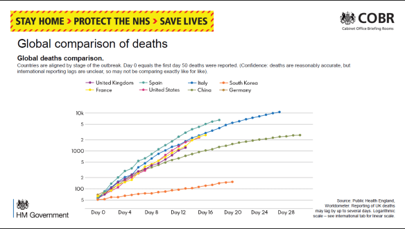
It could be argued that changing a style of presentation risks accusations of “spin” if this detracts from the day-to-day comparison.  However, some changes were made mid-stream. Initially, the daily numbers of deaths were plotted on a log scale labelled obscurely “5, 100, 2, 5, 1000, 2, 5, 10k” (Figure 1). The Daily Telegraph published a redrawn version labelling the grid line below the 5 with “0”.  The label “5” actually meant 50 deaths to allow the trajectory for each country to be aligned from the day 50 deaths were reported.  This is all very confusing.

Fig 1: 30 March. Early line graph with enigmatic Y labels and poor linkage to key.

I wrote to the Telegraph about this, and their presentations improved, as did Number 10’s, with labels 50, 100, 200, 500, etc.  The Metro commented on 1 April that the log scale made the growth in number of deaths appear less steep.  They quoted David Spiegelhalter that each presentation has its “advantages and disadvantages” and “there is no ‘right’ way”. However, less mathematically-minded readers would surely see the choice and the changes as spin.

On 8 April these presentations switched to a linear scale with a scale labelled “2K, 4K, 6K …”, thus avoiding showing “real” numbers or a disturbing axis title “Thousands of deaths”.  I described the use of ‘K’ as “nerdy”, especially as K in IT means a power of 2, not 1000.  It is notable that the daily format of the press conferences was a speech by a minister who then handed over to a scientist or medic to describe the graphs, reinforcing the attitude that graphs are for “boffins” – they might be over your head, dear simple reader.

Within GID one often has to guess at the intention of the author: Was the choice of notation accidental or deliberate?  Whom was this graph designed to inform?  I think we have to assume the direct audience are journalists who then interpret the graphs and data for their readership.  On the other hand, some features are so clearly defaults in spreadsheet graph production (e.g. text written horizontally or vertically), that I stand by the assertion that these presentations were handed out without further consideration or editing.

Downing Street’s daily “Global comparison of deaths” compares countries using a line chart. Initially the lines were just colour-coded with a separate key. Then the country names were written at the end of each line. Because each country’s “Day 0” was a different date, all the lines were different lengths.  Because there were ten lines, some were difficult to identify, as some colours were very similar and there was no redundancy (variation in other line characteristics).  The intended message appeared to be that the UK was buried in the middle, on a similar trajectory to the rest of Europe, with the US far worse (nearly three times as many deaths), while China and South Korea had fared much better.

It’s pretty obvious that crude numbers of deaths is a poor comparator, and there is much confusion between numbers of deaths and death rates. BBC’s More or Less (22 April) discussed this and identified the problem that converting using deaths per million population flung San Marino and Andorra to the top.  But you have the same problem calculating rates for many statistics by London boroughs: Westminster may come out top because so few people live there but many people commute.  The GID approach is to draw a graph (of numbers or rates), consider what message you wish to put across, and to revise the graph to clarify and emphasise.

Cristl Donnelly, on More or Less, suggested a better comparison would be to look at excess deaths in each country. This could also be standardised for population size, but might also allow a division into excess deaths from COVID and excess collateral deaths due to non-availability of other health services.

Another graph showed the number of deaths reported daily.  In the first weeks this was for hospitals only, but from mid-April it showed Daily COVID-19 Deaths in All Settings.  Note this was not necessarily the day the person died. Once the “peak” was passed, it was stressed in most presentations that there was a strong weekend effect with greater delays in reporting and hence a jump up each Monday. As a result the bar graph looks quite chaotic. A 7-day rolling average line clarified the general trend, but no visual effect was used to indicate weekends and the dates were labelled at 3-day intervals. Surely a good presentation would demonstrate the periodicity? (Fig 2)

Fig 2: 30 April. The bars show large day-to-day fluctuations while the smoothing line gives a clear, and more comforting, pattern. Which are weekends?

The other graph I draw attention to is the daily “New UK Cases”, based on the number of positive (PCR for antigen) tests reported that day (Fig 3). Initially this was constrained by test availability. By the third week of April a large excess of laboratory capacity over sampling numbers was reported.  According to the rubric, “there are likely many more cases than currently recorded here”, predominantly because sampling was restricted to hospital patients and staff, then extended to wider NHS staff and care workers, but (at the time of writing) not to the wider population.

Fig 3: 19 April.  The numbers written on bars were subsequently dropped as a separate data file was available. Without knowledge of the number of negative tests, it’s hard to evaluate any trend.

Showing the number of positives against an increasing number of daily tests, but not showing the number of tests, disguises any trend in prevalence. It would help if the number of tests or the proportion positive were also reported; these might be split to show the proportions in groups showing symptoms (expected high) and those tested as contacts (hopefully, lower).  Such comparisons were further hindered by gerrymandering the number of tests in late April to claim to have reached the arbitrary target of 100,000 tests “on” 30 April.

Among the problems with this chart are: the dates are written vertically with no indication of weekends or other divisions that might aid interpretation; the actual numbers are written on the bars, again vertically and hard to compare; for two thirds of the period shown the number varied between 4K and 6K and the largely overdrawn grid gives no assistance for comparison; most of the bars are split into two sections, linked to an enigmatic key (Pillar 1 and 2) which requires further recourse to the rubric for an explanation.

The split between “pillars” had me for one puzzled. It derived from the Secretary of State’s plan for five pillars of activity, but at various times the spokesmen distinguished the groups either by the targets for sampling (patients and hospital staff showing symptoms versus wider NHS staff and households) or by the place of testing (PHE versus commercial labs). I failed to find on the website any clear definitions to discriminate between “critical” and “key” workers.  By the end of April this graph had become quite impossible to learn from: the number of cases detected by NHS labs was going down despite PHE opening its Lighthouse labs but the number from other mass testing (private) labs appeared to increase each day. Hence, it appeared to say nothing about the national prevalence and, since there was no effective treatment, offer no assistance to individual patients.

My interpretation is that this is a case of “reporting the data” out of a sense of duty or as a totem to show the approach is “scientific”.  The layout obscures any visible trend except to show Pillar 2 as increasing over its range. High counts on 5 and 8 April are balanced by lows values on 4, 6 and 7 April, so a smoothing line would make the graph far easier to understand.  Having so many written numbers makes this far more of a table than a graph; it’s no good on a screen, especially during a presentation, but you can print it and turn it sideways. Or you could opt for horizontal bars with time running down the screen; this layout fits less well on a landscape screen, but could be split into a row of panes by week.

For screen use, one could easily angle the dates, add grid lines or background shading for weekends and Easter, round the numbers and omit the commas, move the “6K” gridline to label the actual maximum and add a 5000 gridline, change “0K” to “0”, and make the key one-stage.  As the interest is always in the latest figures, one could move the Y labels to the right-hand end.  I would reconsider the colours: the orange is intrusive and a “warning” tint, and the blue is quite dark. Lighter, more neutral colours for the bars would go better with an overlain smoother.

None of this is rocket science or takes much time or resource, but it does show one has thought about the graph and the audience. It shows competence and consideration.

NEW BOOK Data in Society: Challenging statistics in an age of globalisation (August 2019)

Data in Society: Challenging statistics in an age of globalisation … editors Jeff Evans, Sally Ruane, and Humphrey Southall; Policy Press, 2019.

It is 20 years since the publication of the last Radical Statistics collection, Statistics in Society (1999), and even longer since Demystifying Social Statistics (1979). This third collection of chapters produced under the auspices of Radical Statistics will be published by Policy Press in August 2019.

The use of both ‘statistics’ and ‘data’ in the title is to capture the tension between two views of the materials, the methods and the professional and disciplinary basis of our work: the statistical data, statistical analysis,and the statistics and allied professions / disciplines, on the one hand; and ‘data’ (sometimes ‘big’), data analytics, and data scientists, on the other. The aims of the book include:

to explore ongoing developments in the uses of data and the role of statistics in today’s society, including the increasing diversity of data producers beyond the state, notably private corporations, especially those based on social media and new technologies;

to raise levels of critical understanding in terms of the role and significance of statistical data and statistical claims, and to invite a wider public of non-specialist readers, including third sector, professional and service user groups;

to consider how statistics are used in social discourse and debate, to advance interests and to achieve particular, often political, ends.

The audience for the book will include: teachers, researchers and students in applied statistics, and in research methods for a range of social science, health and business areas; those training or practising in areas such as social work, youth and community work, teaching and nursing;  community activists and others using statistics as a campaigning tool and wanting to critically understand their use by others; and, of course, members and allies of the Radical Statistics Group.

Most higher education and training courses for the groups above include an introduction to the use of statistics. The introduction of Q Step programmes to enhance the level of teaching of quantitative methods to social science undergraduates in UK Universities has led to an increased emphasis on quantitative material across the whole range of social sciences and related fields, in undergraduate and taught post-graduate programmes. A number of the chapters here include clear signposts to the date used in their analyses.

Throughout its gestation, the book has benefited from the support of Radical Statistics and its members. Early planning meetings and travel to face-to-face Editors’ meetings were supported by the Radical Statistics Troika. Throughout, appeals to members, allies, and the mailing list have elicited valuable help, including reviewing of chapters. We thank everyone who has supported the book’s development, and look forward to your participation in the arguments that we hope will be stimulated by the book.

The contents of the book are as follows.

Foreword Danny Dorling, and Preface the Editors

Introduction Humphrey Southall, Jeff Evans and Sally Ruane

Part 1: How Data are Changing Introduction: Humphrey Southall and Jeff Evans

Statistical work: the changing occupational landscape Kevin McConway

Administrative data: The creation of Big Data Harvey Goldstein and Ruth Gilbert

What’s new about Data Analytics? Ifan Shepherd and Gary Hearne

Social media data Adrian Tear and Humphrey Southall

Part 2: Counting in a Globalised World Introduction: Sally Ruane and Jeff Evans

Adult Skills Surveys and Transnational Organisations: Globalising Educational Policy Jeff Evans

Interpreting survey data: Towards valid estimates of poverty in the South Roy Carr-Hill

Counting the Population in Need of International Protection Globally Brad Blitz, Alessio D’Angelo and Eleonore Kofman

Tax justice and the challenges of measuring illicit financial flows Richard Murphy

Part 3: Statistics and the Changing Role of the State Section Introduction: Sally Ruane and Humphrey Southall

The control and ‘fitness for purpose’ of UK Official Statistics David Rhind

The statistics of devolution David Byrne

The uneven impact of welfare reform Tina Beatty and Steve Fothergill

‘From ‘Welfare’ to ‘Workfare’ – and Back Again? Social Insecurity and the Changing Role of the State’ Christopher Deeming and Ron Johnston

Access to data and NHS privatisation: reducing public accountability Sally Ruane

Part 4: Economic Life Section Introduction: Humphrey Southall and Jeff Evans

The ‘distribution question’: Measuring and evaluating trends in inequality  Stewart Lansley 

Changes in working life Paul Bivand 

The Financial System Rebecca Boden 

The difficulty of building comprehensive tax avoidance data Prem Sikka

Tax and spend decisions: did austerity improve financial numeracy and literacy?  David Walker

Part 5: Inequalities in Health and Well-being Introduction: Sally Ruane and Humphrey Southall 

Health divides Anonymous

Measuring social well-being Roy Carr-Hill

Re-engineering health policy research to measure equity impacts Tim Doran and Richard Cookson

The Generation Game: Ending the phoney information war between young and old Jay Ginn and Neil Duncan-Jordan

Part 6 : Advancing social progress through critical statistical literacy Introduction Jeff Evans, Sally Ruane, and Humphrey Southall

The Radical Statistics Group: Using Statistics for Progressive Social Change  Jeff Evans and Ludi Simpson

Lyme disease politics and evidence-based policy-making in the UK Kate Bloor

Counting the uncounted: contestations over casualisation data in Australian universities Nour Dados, James Goodman and Keiko Yasukawa

The Quantitative Crisis in UK Sociology Malcolm Williams, Luke Sloan and Charlotte Brookfield

Critical Statistical Literacy and Interactive Data Visualisations Jim Ridgway, James Nicholson, Sinclair Sutherland and Spencer Hedger

Full fact: What a difference a dataset makes? Amy Sippitt 

Data journalism and/as data activism Jonathan Gray and Liliana Bounegru

Epilogue Jeff Evans, Humphrey Southall and Sally Ruane

Issue 120 now online

I/we had hoped that this issue would include some of the conference papers but it was not to be.  However, my rather hopeless intervention at the beginning of the London Conference, which most – including myself – thought unlikely to be successful has, in fact generated several papers from new authors so that there is not only this issue but a surplus for the next issue.

Contents of this Issue

 The result of course is that the contents of this issue are a mixed bag, so they have been put in the order of author’s surnames. We start, appropriately with a homage to Arthur Bowley, one of the pioneers of statistics and especially a precursor of Tukey’s approach to analysis and presentation.  Written and illustrated, lovingly, by John Bibby, who found it buried in a mess of papers somewhere.  It is followed by a novel approach by Riekkinen and Burns to understand daily journey-to-work commuting behaviour in London and link this to environmentaland health impact, and to devise a replicable framework through which areas can be rated based on low carbon and active travel with this information then being used to support policy implementation for more sustainable commuting.

The next two articles are clear critiques of the current use of statistics.  The first is by Frank Houghton expanding on the revelations concerning the extensive falsification of breathalyser testing statistics by the Irish Police (O’Sullivan, 2017), which have recently escalated into a damning expose of a series of more incriminating practices. What started out as an investigation into inflated activity figures by some Irish Police officers (Garda) has subsequently revealed financial misconduct, wholesale errors and incompetence, and extensive data falsification and a nefarious cover-up at the highest levels. The second is by Brendan Lawson on the coverage of the 2017 South Sudanese Famine by The Guardian and BBC News.  There were three interlinked findings: one, the United Nations was the source for the vast majority of statistics; two, these statistics were unilaterally accepted as indisputable truths by the news media; three, they underpinned and constructed a narrative of constitution-measurement-solution. This framed journalists’ use of statistics as serving to reinforce existing power dynamicsof the humanitarian field.

Prospects for RSN 121

Whilst we do have some material forthe next issue RSN 121, due in October 2018, we would like it to be at least partly devoted to that conference.  The Editor has written to each of the speakers asking if they can produce a paper but we think it would also be very useful if any of those who attended (or did not attend) have any ideas or thoughts on the subjects raised could make a contribution, however short. I/we have written to all of the authors individually and circulated all members asking them to submit anything they want to write on one or more of the themes addressed in the conference. 

The themes addressed at the conference were the issue of inequality as it relates to income, reproductive health and intimate partner violence, while the fourth explored the feasibility of low-carbon towns. The day included workshops specifically related to these themes, and one on the role of the statistician in the age of alternative facts.

Please send anything directly to Roy Carr-Hill roy.carr_hill@yahoo.com with Subject Title: Contribution on 2018 London RadStats Conference: theme Income Inequality OR ReproductiveInequalities OR Inequality and Intimate Partner Violence OR Feasibility of Low-Carbon towns OR Role of statistician in the age of alternative ‘facts’.

Roy Carr-Hill

Osborne’s Autumn statement

Well, many of you will have seen the budget and Balls’ response which began with a good deal of stuttering, widely reported by no explanation. If anyone has a hypothesis about why Balls began his retort by effectively stuttering, I would be glad to know. Even though he recovered after a few minutes, his response wasn’t very effective.

The primary reason for that I would argue for his ineffectiveness is that Balls, and Ed as well, has no well developed alternative to articulate. Effectively, he and others in the Labour Party assume as true the neoliberal economic theories that underpin Osborne’s major policies, though he slightly modified them in this statement. Policies guided by neoliberal economic principles have failed not only this time but every time they have been tried, either in western countries or in developing countries. This is fundamentally because they have no empirical relationship to the real world. They only work in toy economies.

They look correct to some people because the Keynesian position has been distorted and Keynes didn’t quite get all of it right. After the publication of the General Theory, he was already thinking about how to revise it. The theory should really be called the Keynes-Kalecki theory, as in a review of the General Theory the year following its publication, Kalecki corrected errors in Keynes’ theory of effective demand.

QE, which King is so fond of, is ineffective re job creation because it directs funds to banks who either hoard it or use it to pay down their toxic balance sheets. Osborne almost seemed to realize this when he proposed infrastructure projects. However, it looked a bit too little too late. And he doesn’t yet seem to have bitten the bullet. Besides, the money that has been put into the various QEs undertaken by certain sovereign governments is not enough to even make a dent in the banks’ toxic balance sheets, so great are their debts. Basically, it is money thrown away.

An interview with Robert Choate showed that Choate, while not being able to criticize Osborne due his present position, showed that he knows that credit ratings are meaningless for sovereign states with their own currency and that government doesn’t have to borrow, unless it decides to because the relevant interest rate is low. As for the basic interest rate, it can be kept low in perpetuity. Taxes should be used to control inflation by inhibiting spending and to direct spending into certain areas, as well as legitimating the sovereign currency. They should never be thought of as a basis for government spending, because government doesn’t need taxes to back their spending, something Choate knows only too well.  When pressed by Paxman in the interview, to explain his hints, he only said that we will have to wait to find out in his memoirs. However, no one, even Paxman, later picked up on Choate’s hints in the interview about what he really thinks of Osborne’s policies.

To rely on exports when every other country with whom you would do business is experiencing the same difficulty is incredibly stupid and shows that Osborne doesn’t quite know what he is doing. His comments about those on welfare were exceedingly ignorant. The stupidity of his position is that people who aren’t working don’t really want to would only be true were there jobs to go to. The basic fact is that there are fewer jobs than there are people looking for them. The jobs have to be there first to justify his basic assumptions about people’s motivations. History does not support Osborne’s ignorant comments.
In fact, Osborne’s social policies and comments directed to those on benefits, who are obviously not well off, is redolent of the ideas of the late 19th and early 20th century social Darwinists. For those of you interested in the way in which evolutionary biological ideas creep into discussions of the nature of human society, it may be of interest to those who do not read in this area that Darwin did not subscribe to the view of unbridled competition even for the Primates. It follows mutatis mutandis that Darwin’s view of chimpanzees applies to human social groupings. This view of unbridled competition may have seemed self evident in the late 19th and early 20th centuries, but seems rather dated now. Yet, the idea refuses to die. A number of Osborne’s social policies could have come right out of early 20th century social Darwinist tracts. One of social Darwinism’s greatest critics was Lester Ward. Alas, no commentator has yet made this connection. It seems so obvious to me. Am I missing something?

Now, one problem with the post by Pilkington is that it is rather technical. And it is a piece on the political economy of the financial sector rather than economics per se. That should make it easier to read, but for some it might not. Basically his message is that by putting the money back into banks, it acts as a feeder mechanism for financial speculation, which is what needs to be toned down rather than reinforced.

I have also included a piece from the Independent by David Blanchflower. His position is that Slasher Osborne’s jobs policies are guided, not by empirical evidence, but by ideology. We all know this, but is is salutary to see figures from the Department of Works and Pensions that reinforce this view. It is impossible to believe that millions of people are scroungers. It defies rational consideration.

Here are the links:

Blanchflower: http://www.independent.co.uk/news/business/comment/david-blanchflower/david-blanchflower-ideology-rules-the-coalitions-jobs-policies-8374461.html

Pilkington: http://www.nakedcapitalism.com/2012/12/philip-pilkington-monetary-policy-and-metaphysics-how-economists-try-to-naturalise-terrible-policies-and-disappear-into-their-own-theories.html

Post contributed by Larry Brownstein

Mis-measurement of health and wealth: Radstats Conference & AGM, 24-25 Feb 2012, London

British Library logoFebruary is upon us! If you’ve not had the chance, please note that you can still book a space for the Radical Statistics conference to be held on Friday, February 24th 2012 at the British Library Conference Centre, followed by a half-day interactive workshop and AGM on Saturday 25th.

Don’t miss our challenging and engaging programme with talks on:

·       Measuring health – history and methods

·       Deception in medical research – scientific and regulatory failure

·       Deception in financial statistics – how this contributes to financial mayhem

Speakers:  Roy Carr-Hill, Val Saunders, Dr Aubrey Blumsohn, Prof. David Healy, Prof. Prem Sikka, Ann Pettifor, Prof. Allyson Pollock & Howard Reed.

Both days will provide a great opportunity to learn and discuss how misleading statistics are used to bolster political preferences and how difficult issues can be demystified with clear statistics.

All interested in research and statistics are welcome – the conference is neither technical nor limited to professional researchers.

Please find the programme and related information at www.radstats.org.uk/conf2012, where you can make your booking now!